How to Read Candle Chart in Stock Market
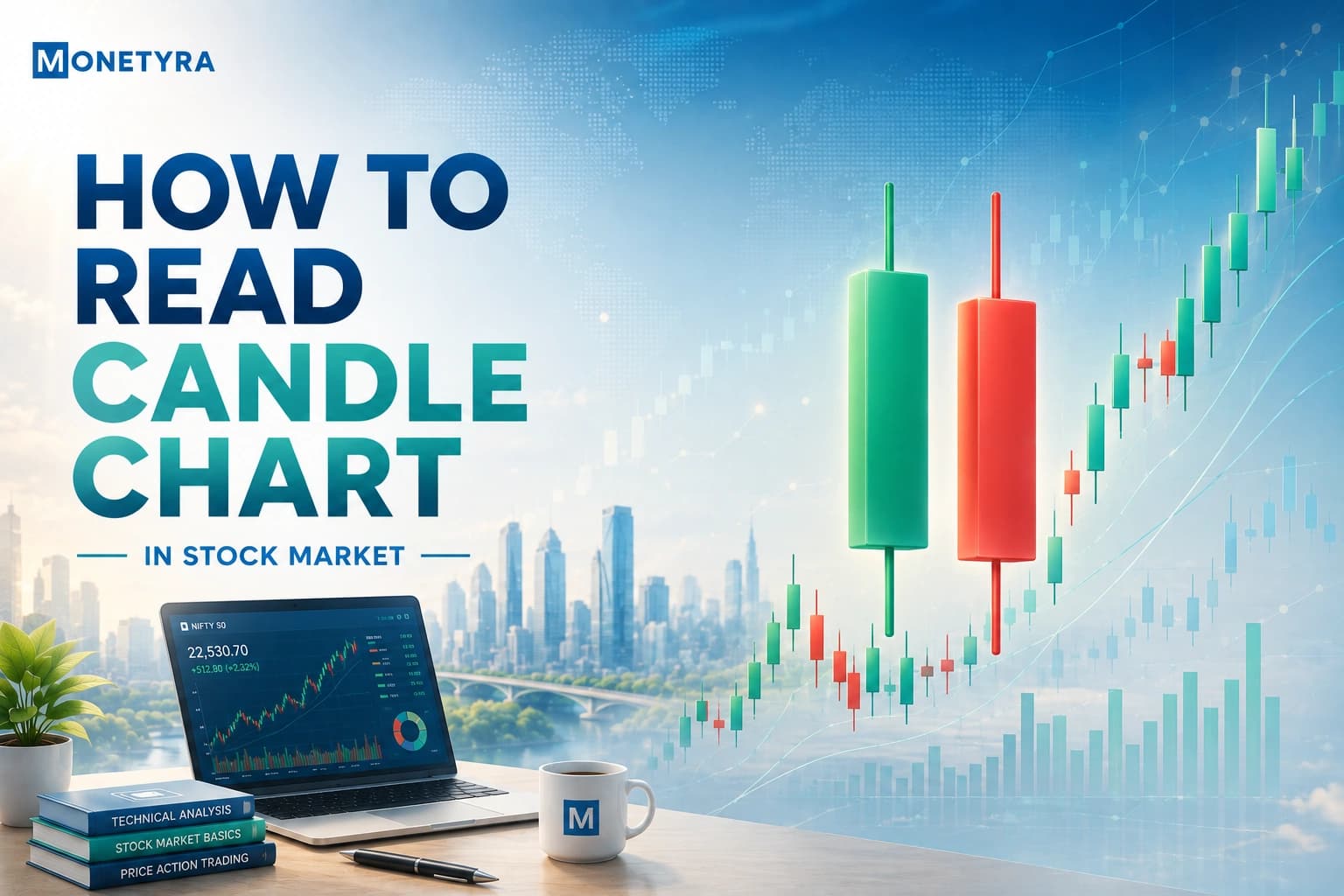
Learning how to read candle chart in stock market dynamics is like learning the basic alphabet of price action. Every single candle tells a continuous story of an ongoing tug-of-war between buyers who want to push prices higher and sellers who want to drive them down. Instead of staring at a cluttered line chart that only shows where a price ended, candlestick charts show you the entire emotional journey of the market over any chosen timeframe.
Quick Takeaways
- Candlestick charts visually display market price movement over a set timeframe using four key values: Open, High, Low, and Close (OHLC).
- The color and size of the real body indicate who won the session, while the upper and lower wicks reflect price rejection.
- Reading candlesticks in isolation without checking overall trends, volume, or key support levels significantly increases your risk of bad entries.
What Is a Candlestick Chart in the Stock Market?
A candlestick chart is a visual price chart that displays the Open, High, Low, and Close (OHLC) prices of an asset for a specific timeframe. Unlike standard line charts that only connect closing prices, candlesticks show the full volatility and price range of every trading period.
When you look at a daily stock chart, a single candle summarizes everything that happened during that trading session. It lets you quickly assess market sentiment without calculating complex mathematical technical indicators.
- Line charts hide volatility: They only show the final closing price, masking intraday price spikes and sharp drops.
- Candlestick charts reveal sentiment: They expose market fear and greed by showing exactly how high buyers pushed the price and how low sellers managed to drag it.
The Components of a Candlestick: OHLC Explained

Every candlestick consists of two main visual parts: the central rectangular block called the real body, and the thin lines extending above and below it called wicks (or shadows). Together, these components track four specific price points known as OHLC data.
| Candlestick Component | Visual Feature | Market Meaning (Buyers vs. Sellers) |
|---|---|---|
| Open (O) | Border of the body | The price at which trading started during the period. |
| High (H) | Tip of the upper wick | The absolute highest price buyers reached before sellers pushed it back. |
| Low (L) | Tip of the lower wick | The absolute lowest price sellers reached before buyers stepped in. |
| Close (C) | Border of the body | The final price at which trading finished during the period. |
| Real Body | Colored block | The price spread between the market Open and Close. |
| Wicks / Shadows | Thin lines | The price extremes rejected by the market during the timeframe. |
Tip: If the real body is very long, it indicates strong directional momentum—buyers or sellers were in complete control throughout the session.
How to Read Green and Red Candles
Understanding how to read candle chart in stock market software comes down to tracking colors and wick lengths. Most modern trading charts use green and red candles by default.
Green (Bullish) Candles
A candle turns green when the Close price is higher than the Open price. This tells you that buyers (bulls) dominated the session and successfully drove the stock price upward. The Open price sits at the bottom of the real body, and the Close price sits at the top.
Red (Bearish) Candles
A candle turns red when the Close price is lower than the Open price. This indicates that sellers (bears) took control of the session and forced the stock price down. The Open price sits at the top of the real body, and the Close price sits at the bottom.
Wick Length Psychology
The wicks reveal price rejection:
- Long upper wick: Buyers tried to drive the price up, but sellers stepped in aggressively and pushed it back down before the session ended.
- Long lower wick: Sellers tried to crash the stock price, but buyers stepped in near the bottom and pushed it back up.
Warning: Never trade a candlestick pattern based on wick rejection until the candle officially closes—an active candle can change its appearance completely in the final seconds of trading.
Basic Candlestick Patterns Every Beginner Should Know

Once you understand single candle anatomy, you can start identifying basic single-candle structures.
- Hammer: Features a short body at the top with a long lower wick (at least twice the body length). Found at the bottom of a downtrend, it signals that buyers are stepping in to defend prices.
- Doji: Features almost no real body because the Open and Close prices are nearly identical. It represents total indecision between buyers and sellers.
- Marubozu: A large real body with virtually no upper or lower wicks. It signals strong conviction; a green Marubozu means buyers held control from the opening bell to the final minute.
- Engulfing: Features a candle whose body completely covers the body of the previous day’s candle. A bullish Engulfing pattern appears after a downtrend and signals a strong shift in momentum toward buyers.
- Morning Star: A three-candle pattern starting with a long red candle, followed by a short-bodied middle candle (indecision), and ending with a strong green candle. Found at the bottom of a downtrend, it signals a major trend reversal.
While you may often look for candlestick setups, relying purely on single- or multi-candle patterns without confirming support/resistance levels or trading volume increases your risk of bad entries. Learning to spot these patterns gives you a solid entry trigger, but strict position sizing is what ultimately protects your capital when a trade fails.
Reading Candlestick Charts on Indian Trading Platforms
If you trade in Indian equity markets, major retail trading apps display standard green and red candlestick setups by default.
When looking at Indian stocks listed on the National Stock Exchange (NSE) or Bombay Stock Exchange (BSE), selecting the right chart timeframe depends on your goal:
- Intraday trading: Select 5-minute or 15-minute timeframes to observe fast price swings during market hours (9:15 AM to 3:30 PM IST).
- Swing trading or long-term investing: Switch to daily (1D) or weekly (1W) charts to filter out short-term market noise and observe real trend momentum.
Conclusion
Mastering candlestick charts gives you a clear visual map of market sentiment without relying on lagging indicators. By evaluating the real body size, wick rejection, and green versus red color dynamics, you can immediately tell whether buyers or sellers hold control. Practice observing these patterns on historical daily charts before executing real market trades.
Learn how visual chart reading fits into overall equity market analysis.
Disclaimer: This article was written with the help of AI and reviewed by the Monetyra editorial team. It is for educational purposes only and should not be considered financial advice. Trading and investing in financial instruments involve significant risk of loss and are not suitable for all investors. Please consult a licensed financial advisor before making any investment or trading decision.
In India, equity markets are regulated by Securities and Exchange Board of India (SEBI). Readers are advised to verify the regulatory status of their broker and ensure compliance with applicable Indian laws before investing.
FAQs
Start by checking the candle color: green means the price closed higher than it opened, while red means it closed lower. Look at the real body to see the distance between open and close, and inspect the wicks to see the session’s high and low price points.
The four main elements are the Open, High, Low, and Close (OHLC) prices. The Open and Close form the borders of the central real body, while the High and Low form the upper and lower wick extremes.
A green candle shows a bullish session where the closing price was above the opening price. A red candle shows a bearish session where the closing price fell below the opening price.
No single candle pattern guarantees success, but reversal candles like the Hammer and Doji or momentum patterns like the Marubozu are widely monitored when confirmed with volume.
The body shows the actual net price change between the open and close, representing final session control.